Case Study | Symplicured
Design Process

Deliver
-
Prototype
-
Usability Test (2x)
Develop
-
Features to Adopt
-
Brand Voice
-
Mood Board
-
Pattern Library
-
Sketches
-
Wireframes
Define
-
Personas
-
User Journey Maps
-
Problem & Solution Statements
Discover
-
Market Landscape Research
-
As Is Website Evaluation
-
User Interviews
01/
Market Landscape Research

A previous General Assembly (GA) Student Team did a round of redesign work for Symplicured back in Sep 2020 and they conducted a competitive analysis on international brands. Bearing in mind the recency of the competitive analysis conducted, we decided to focus on the Asian market.


Sep 2020
Apr 2021

-
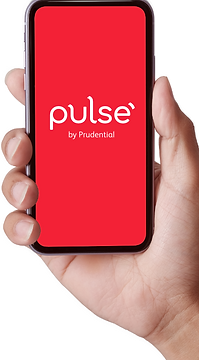
Pulse mobile app - ‘Symptom Checker’ & ‘Healthcheck’ features powered by UK Health Service Provider Babylon Health
-
11 asian markets in 12 local languages
-
Malaysia, Philippines, Indonesia, Hong Kong, Singapore, Vietnam, Thailand, Taiwan, Laos, Cambodia & Myanmar
-
-
Over 500,000 registered users


-
Japanese medtech startup founded in 2017 by a medical doctor and an AI engineer. It aims to expand its presence abroad.
-
Oct 2020 - Established APAC HQ in Singapore and started to provide service to healthcare providers in Singapore
*As of Apr 2021, the English version of Ubie has yet to be launched. Hence, we are unable to assess its functionality.
02/
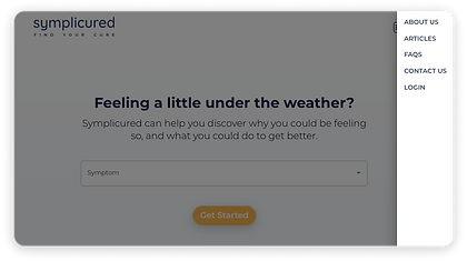
As Is Website Evaluation

We conducted heuristic analysis and collected user feedback through user interviews, with the aim of improving overall user experience.
We focused on three aspects of Symplicured’s website - Home page, Medical Questionnaire and Results page.
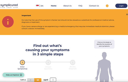
Home Page
Users’ Feedback
-
62% of users prefer to have the flexibility to search free-text their symptoms rather than selecting from dropdown menu
-
53% of users felt that the list of shortlisted symptoms should be more comprehensive

Heuristic Analysis - Consistency and standards
Menu hidden in hamburger icon (more commonly used on mobile)
Recommendation: To have a visible top-level global navigation bar for desktop version so that website does not deviate from industry convention that users are familiar with.

Medical Questionnaire
Users’ Feedback
-
62% of users want a personalised experience when answering questions (within the medical questionnaire)
-
They prefer subsequent questions to be tailored based on their responses to initial questions, rather than generic-sounding questions that (seem like) can be applied to anyone
Results Page
Users’ Feedback
-
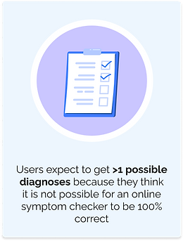
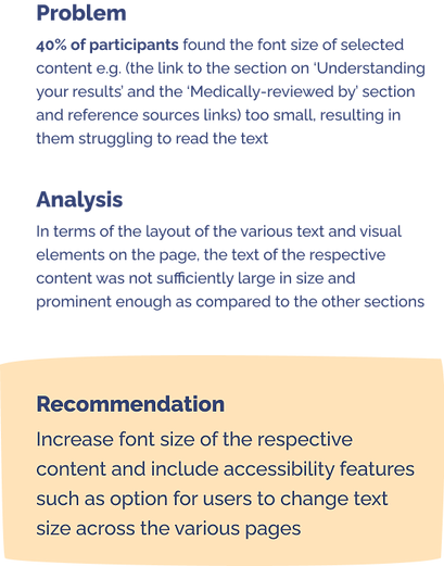
46% of users want diagnosis to be explained and in layperson terms
-
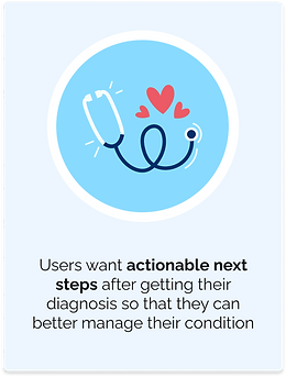
38% of users noted that actionable next steps are lacking

Heuristic Analysis - Match between system and the real world
Design should speak the users’ language
Recommendation: Complex (Scientific name of diagnosis) and vague terms (‘Basis of diagnosis’ and ‘Strong evidence’) should be explained using words and concepts familiar to users, and refrain from the use of medical jargons.
Key Takeaways

Home Page
Medical Questionnaire
Results Page
-
Introduce use of top-level global navigation
-
Introduce nested questions
-
Re-organise content hierarchy
-
Include explanation for medical jargons and key section headings (E.g. Strong evidence, Basis of diagnosis)
03/
User Interviews

We conducted user research interviews with 13 users aged between 29 - 53 years, who searched online for a symptom within the last 30 days. Interview sessions were moderated and conducted remotely via Zoom.
Key Insights


04/
Personas


05/
User Journey Maps

We created a visual representation of the personas' journey as they search online to learn more about the symptoms they are experiencing. By fleshing out their thought process and emotions, we aim to gather a more holistic view of the user experience by uncovering moments of frustration and delight, as well as discover opportunities to address users' pain points.


06/
Problem & Solution Statements & Hypothesis


07/
Features To Adopt

Having defined the problem and identified key areas for improvement, we shortlisted features to adopt to meet the needs of the personas.


-
‘When to see a doctor’
-
Map to find nearest clinic
-
‘Basis of diagnosis’
-
‘How common is this diagnosis’
-
Body map
-
Medically-reviewed reference sources
-
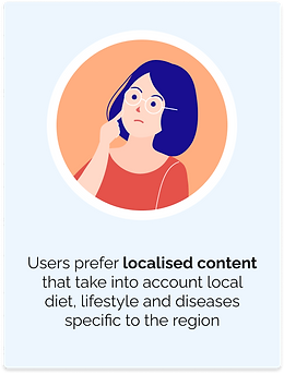
Videos containing localised content on exercise tips
-
‘Prevention’ tips
-
Download PDF feature
-
Use of tabs to categorise the information clearly
-
Medical alert - ‘Please consult a doctor immediately’
-
‘Questions to ask a doctor’
-
Highlighting Symplicured’s track record to lend credibility
-
‘Understanding your results’
-
Nested Questions
-
‘I don’t know’ option for users when answering medical questionnaire
Acute Andrew
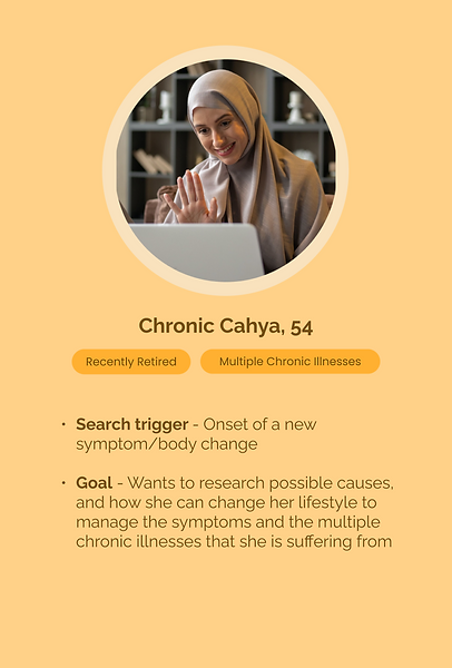
Chronic Cahya
08/
Brand Voice

Brand voice was developed using insights from user research, in alignment with Symplicured's brand.


09/
Mood Board
We kept the same look and feel while introducing more shades of colours to help guide users to better navigate the website. With the new shades, it adds a bit more hierarchy and enhances visual interest.
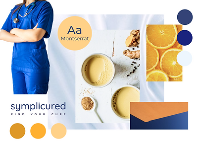

Primary colour - White. A colour that is synonymous with positivity, it projects safety and sincerity. Just as with doctor’s white coat, a traditional symbol of the medical profession since the late 19th century.
Secondary colours - Blue to give a sense of calm. Yellow to add some cheer.
Overall, the objective is to maintain the website’s clean and professional look and feel while making it more welcoming and approachable to users.

10/
Pattern Library


11/
Design Evolution


12/
Usability Test
We conducted 2 rounds of usability tests.
Purpose
-
Gather insights on how users navigate the website to learn more about their health concern and how they can better manage it
Method
-
5 participants each round
-
Moderated sessions, remote via Zoom
Test Scenario 1
You woke up in the morning with a back pain, but you are not sure why
Task #1: Find out more information about this back pain you are experiencing
Task #2: Learn how to make changes to your lifestyle to manage this condition
Task #3: View more videos on preventing this pain from recurring
Metric: To complete in less than 10 minutes, with no more than 1 error
Metric: To complete by ‘viewing’ 1 x video in ‘Prevention’ tab
Metric: To complete by reaching modal view of account sign up
Test Scenario 2
A few days later, you realise that the back pain has worsened and the pain has now spread to the groin area
Task #4: Find out more information regarding the worsening of your symptoms
Task #5: Seek immediate medical assistance at the nearest clinic
Metric: To complete in less than 10 minutes, with no more than 1 error
Metric: To complete by selecting at least one way to seek medical assistance


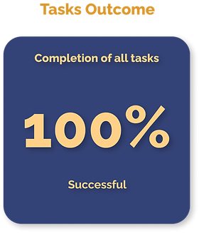
Results
All 5 participants were successful in meeting the metric set for each task.
At the end of the test, we asked participants to complete a System Usability Scale (SUS) survey to evaluate the usability of the website. In addition, we also asked participants to complete a Net Promoter Score (NPS) survey to find out if they would recommend the website to their friends and family.


Results
All 5 participants were successful in meeting the metric set for each task.
Similar to the first test, a System Usability Scale (SUS) survey and a Net Promoter Score (NPS) survey were conducted at the end of the test session.


Summary
13/
Problems vs Solutions


14/
Outcomes Of Iterations

Evolution of System Usability Scale (SUS) Score


Industry Average (68)
Evolution of Net Prompter Score (NPS)


*Software & App Average (28)
15/
Next Steps

-
Improve website’s accessibility features to cater to young senior users
-
Review all questions in medical questionnaire to improve phrasing of questions
-
Conduct further suveys/ AB testings to evaluate users’ receptiveness to signing up for an account when given various health-related incentives
Credits:
Mock up computer images & All illustrations - www.freepik.com
Persona (Male) - Photo by Mason Wilkes on Unsplash