

Overview
Founded in 2020, Symplicured is a Singapore startup whose mission is to make healthcare search simple, easy to understand and actionable.
Together with 3 other team mates, we created this website redesign solution for our client, Symplicured during our User Experience Design Immersive (UXDI) course at General Assembly, Singapore.
Our solutions focus on enhancing search process and redesigning content for better management of health symptoms.

Platform:
Desktop
Timeline:
Apr 2021 | 3 Weeks
Tools:
Figma | Miro | Google Sheets
Team:
Christopher Lee | Ding Hui Wen | Fiona Chua | Fiona Tan
My Role:
User Research | Ideation | Copywriting | Usability Test
As Is and Redesigned
As Is
Redesigned
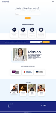
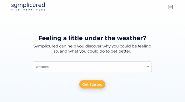
Home
As Is
Redesigned
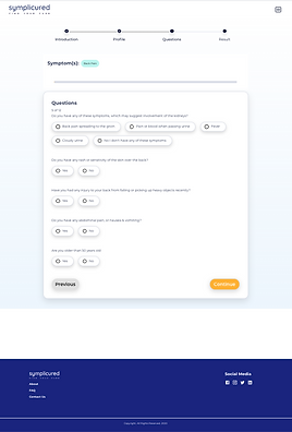
Medical
Questionaire
As Is
Redesigned

Results


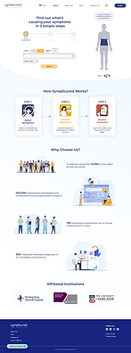
Goal
To provide users with a simple and direct way of searching their symptoms, and equip them with knowledge about their diagnoses so that they are better positioned to manage their symptoms confidently.

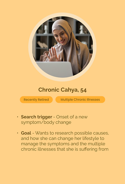
Personas


User Problems
Insufficient & non-localised information
#1/3
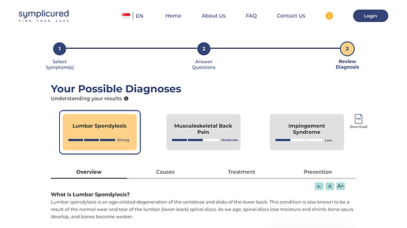
(a) Inadequate possible diagnosis
(b) Lack actionable steps
(c) Lack localised health content

What’s next after getting the diagnosis? I want to know how to slow down or stop the worsening of the condition. Need more information.
- User 3
Only 1 diagnosis makes me wonder if i can trust this website. Not even a doctor can be 100% correct.
- User 1
I would want to see the localised version of things because Asian bodies are different from Non-Asian.
- User 5
Credibility of website
#2/3
For me to trust a health-related website, first I want to know who wrote the content, or where the information came from.
- User 8
Struggle to communicate area of discomfort
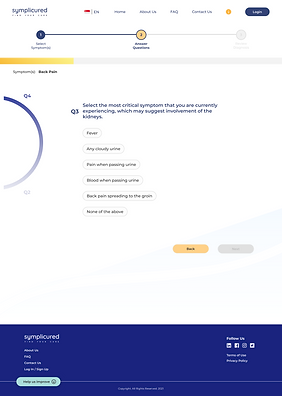
#3/3
Not having the right vocab, not being able to communicate area of discomfort. It can be frustrating.
- User 12


Design Process


Solutions

#1/3
Insufficient & non-localised information
(a) Inadequate possible diagnosis
-
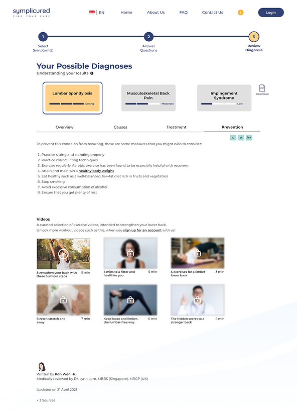
Provision of 3 possible diagnoses
As Is

Redesigned
#1/3
Insufficient & non-localised information
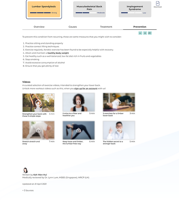
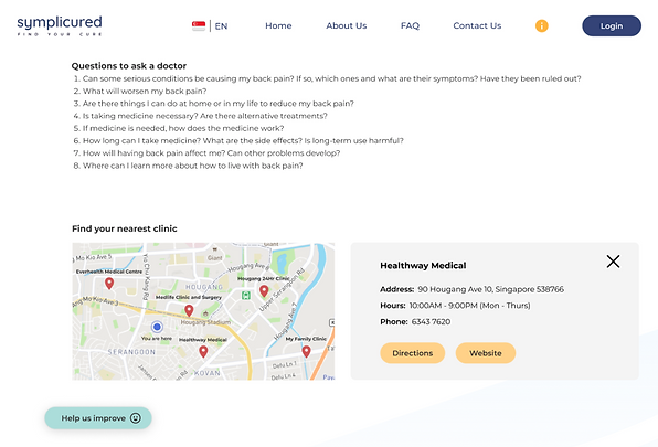
(b) Lack actionable steps
-
‘Prevention’ tips & videos
-
‘Find your nearest clinic’ information
Redesigned
As Is

Redesigned
#1/3
Insufficient & non-localised information
(c) Lack localised health content
-
Videos with localised content
-
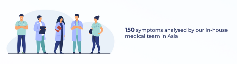
Highlight in-house medical team in Asia
Redesigned
Redesigned

#2/3
Credibility of website
-
Indicate medically reviewed content & cite reference sources
-
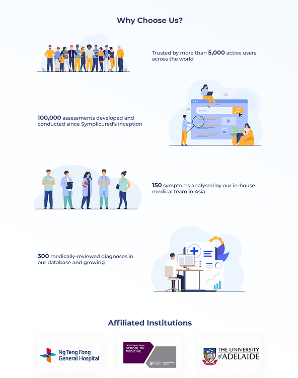
Highlight website’s track record (Statistics)
Redesigned


Redesigned
#3/3
Struggle to communicate area of discomfort
-
Use of body map to aid search
As Is
Redesigned

Outcomes of iterations

Evolution of System Usability Scale (SUS) Score


Industry Average (68)
Evolution of Net Prompter Score (NPS)


*Software & App Average (28)
Retrospective
This project was an opportunity to experience UX working in the real world where business goals and technology capability come into play. Finding the sweet spot made the project more interesting as it pushes the team to be more creative in problem solving.
The daily stand-ups with Symplicured’s team allowed the team to get familiarised with working in an agile environment. The regular updates enabled both parties to align expectations and it also provided clarity in design direction.
Overall, this project validated the value of users’ voice. By aligning products to meet users’ needs, they will find their experience with Symplicured more meaningful and delightful. This is demonstrated by the significant improvement in SUS and NPS scores.
Looking forward to designing more users-driven experience.

Special thanks to project team members:
Christopher Lee, Project Manager & UX Researcher
Fiona Tan, UX Designer
Ding Hui Wen, UI Designer
Credits:
Mock up computer images & All illustrations - www.freepik.com
Persona (Male) - Photo by Mason Wilkes on Unsplash