


Overview
Founded in 2001, ACRES is a Singapore non-profit organisation that strongly believes in promoting community involvement in tackling animal welfare issues and in building partnerships with all related bodies to improve animal welfare.
Besides attending to animal rescue cases in their daily operations, they also adopt research projects on the use of animals in various fields. Research findings are then used to educate the public.
As with all non-profit organisations, ACRES rely on its contributors, donors, volunteers and partners to run its programmes and initiatives
Together with 4 other team mates, we created this website redesign solution during our User Experience Design Immersive (UXDI) course at General Assembly, Singapore.
Our solutions focus on improving online experience for prospective donors and volunteers.
Platform:
Desktop
Timeline:
Mar 2021 | 2 Weeks
Tools:
Figma | Miro | Optimal Workshop | Google Slides | Google Sheets
Team:
Brendan Chow | Calista Chen | Fiona Chua | Khoo Yuin Yi | Miranda Gomasjaya
My Role:
User Research | Ideation | Usability Test
As Is and Redesigned
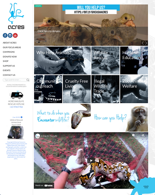
As Is

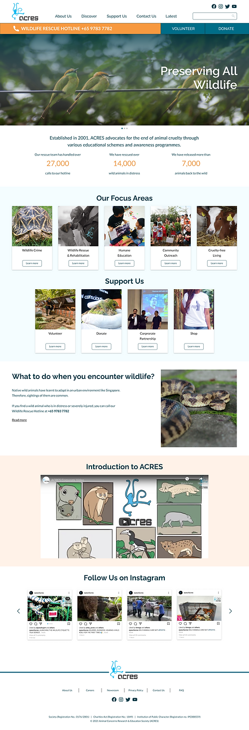
Home
Redesigned
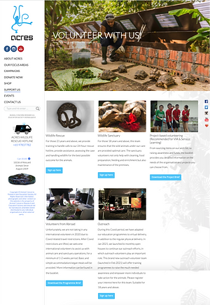
As Is
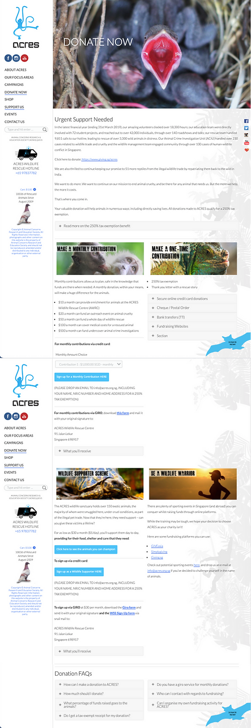
Donate
Redesigned

As Is
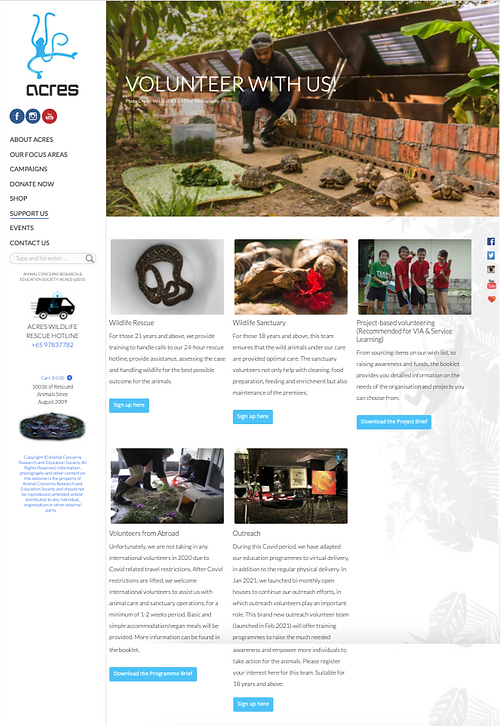
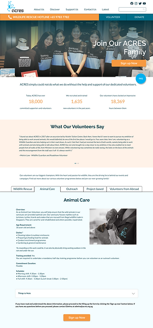
Volunteer
Redesigned

Brief
To improve the online experience for prospective donors and volunteers by gathering insights of main users and reviewing redesign opportunities of the existing ACRES website while aligning with the goals and brand of the website.
Personas
With insights gathered from user interviews, we synthesised the data and developed 2 personas to help guide our design decisions and priorities.


User Problems

1/3
No clear & quick access to key tasks & information
As Is
-
Call-to-action buttons to key tasks are not easily or readily locatable
2/3
No clarity on non-profit organisation’s utilisation & disbursement of funds
-
Lack of clear, impactful and easily accessible information on fund usage and disbursement
As Is

3/3
Information overload
-
Lack of content hierarchy
-
Ineffective categorisation of content
As Is
As Is

Problem Statement
Having developed our personas, we next defined the problem statement to set clear direction for our design process.
The Problem
Contributors have difficulty providing support to ACRES’ causes when they do not fully understand the organisation, what it does and what services it provides, due to obscure information and processes.
Design Process
Solution Statement
The Solution
Contributors need an organised and accessible way to learn about ACRES and find suitable opportunities to contribute to their desired causes with confidence.
Key Focus Areas
Guided by the solution statement, we identified 3 key focus areas that will make significant impact to user experience.

Clear & concise information
Re-organise and simplify existing information to avoid cognitive overload

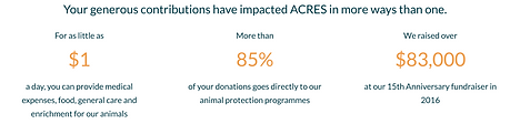
Build credibility
Be transparent by showcasing organisation's performance, utilisation and disbursement of fund via use of statistics

Efficient & smooth process
Create multiple touch points for key actions to increase accessibility and efficiency in performing tasks
Solutions
1/3
No clear & quick access to key tasks & information
-
Relocate key call-to action buttons to top of screen to increase accessibility
-
Create multiple touchpoints for key call-to-action buttons
As Is

Redesigned


Redesigned


2/3
No clarity on non-profit organisation’s utilisation and disbursement of funds
-
Use of visually prominent bite-size statistics to capture attention
-
Highlight credible & impactful message to show transparency & instil trust
As Is

Redesigned

3/3
Information overload
-
Use of tabs and accordion to chunk information into bite-sizes to make it easier to digest
-
Detach volunteer information from sign up form
As Is
As Is

Redesigned

Redesigned
Results of System Usability Survey (SUS)
SUS Score
Usability Test 2
90.5
Grade A
(Excellent)
SUS Score
Usability Test 1
87
Grade A
(Excellent)
Prototype
Retrospective
This team project was a good learning experience because we get to learn from each other, in particularly during the design studio session where we exchange ideas and improve on the design collectively.
The key learning from this project is team management and the role of timeboxing. Timeboxing is key to managing brainstorming/discussion sessions, especially for a project with short timeline. In order for the project to push forward, it is imperative to keep to the fixed time period.
Overall, it was a rewarding 2 week. It was an opportunity to put our UX knowledge into practice and to gain new knowledge at the same time.
Special thanks to project team members:
Khoo Yuin Yi, Project Manager & UX Designer
Brendan Chow, UX Designer
Calista Chen, UX Designer
Miranda Gomasjaya, UX Designer
Credits:
Banner Image of Squirrel - Photo by Caleb Martin on Unsplash
Persona (Purposeful Pete) - Photo by Good Faces on Unsplash
Persona (Cautious Caleb) - Photo by Bibek Thakuri on Unsplash