Case Study | ACRES
Design Process
Deliver
-
Prototype
-
Usability Test (2x)
Develop
-
Mood Board
-
Style Guide
-
Sketches
-
Wireframes
Define
-
Personas
-
Problem & Solution Statements
-
Key Focus Areas
-
Information Architecture
-
User Flows
Discover
-
Benchmarking
-
User Interviews
01/
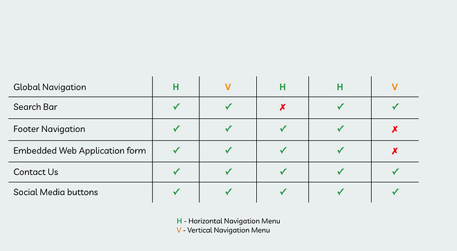
Benchmarking
We conducted a benchmarking analysis to learn good practices from other established non-profit organisations (NPOs) with similar mission as ACRES. The 4 NPOs below were selected because of their long and rich history of doing charity and wildlife conservation work.


What we can adopt
-
4/4 have less than 5 category labels in their global navigation menu
-
4/4 present comprehensive information in a clear and concise manner
-
4/4 have multiple touch points for key actions that lead users to the same page
-
3/4 have prominent “Donate” button at top right of screen
What we would avoid
-
Tiny fonts used in global navigation menu
-
Search bar in footer navigation
Feature Analysis
-
3/4 have horizontal navigation menu, the most common website navigation menu
-
ACRES does not have a footer navigation
-
ACRES does not use embedded web application form


Key Takeaways
We reviewed the findings and shortlisted the following to adopt for the redesigned website.
-
Horizontal global navigation menu with clear and concise category labels
-
Prominent key call-to-action button on global navigation
-
Footer navigation to hold supplementary information
-
Multiple touch points for key actions that lead users to the same page, unlike ACRES' multiple touch points that lead to different pages, thus causing confusion to users
-
Embedded web application form to eliminate redirection to external platforms
02/
User Interviews
I want my contribution
to be impactful.
I look for organisations
that resonate with my values and beliefs.
I am cautious when making a contribution to non-profit organisations.
I seek transparency on how the donated money
is being used/disbursed.
I trust organisations
that are licensed and registered.
I am unsure which volunteer opportunities
are suitable for me.
I feel overwhelmed when
I am unable to digest information regarding donation or volunteering.
I find the volunteering/donation process to be cumbersome.
We interviewed 12 people, aged between 24 to 47 years old. All of whom have made contributions to non-profit organisations by offering their skills, time and/or in kind/monetary donations. Below are some quotes that flash out their goals, needs and frustrations.
Key Takeaways
-
All interviewees have some experience with both donating and volunteering and they are not mutually exclusive
-
Important to build trust online as contributors seek to verify non-profit organisation's credibility
-
Clear, concise, easily accessible information and efficient process increase user engagement
03/
Personas
With insights gathered from user interviews, we synthesised the data and developed 2 personas to help guide our design decisions and priorities.


04/
Problem & Solution Statements
Having developed our personas, we next defined the problem and solution statements to set clear direction for our design process.
The Problem
Contributors have difficulty providing support to ACRES’ causes when they do not fully understand the organisation, what it does and what services it provides, due to obscure information and processes.
The Solution
Contributors need an organised and accessible way to learn about ACRES and find suitable opportunities to contribute to their desired causes with confidence.
05/
Key Focus Areas
Guided by the solution statement, we identified 3 key focus areas that will make significant impact to user experience.

Clear & concise information
Re-organise and simplify existing information to avoid cognitive overload

Build credibility
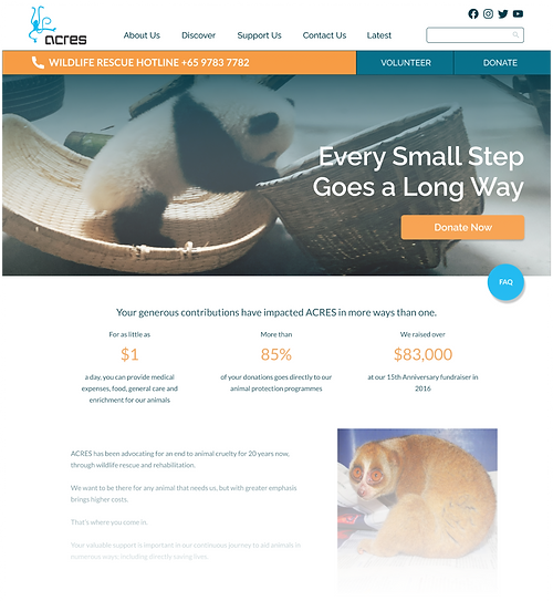
Be transparent by showcasing organisation's performance, utilisation and disbursement of fund via use of statistics

Efficient & smooth process
Create multiple touch points for key actions to increase accessibility and efficiency in performing tasks
06/
Information Architecture

Click image for site map
We conducted a content inventory exercise and created a site map of the as is website to help us better understand how information is organised and to seek opportunities for optimisation.
Key Takeaways
-
Too many categories in the global navigation menu; Mix of high and low value content
-
To remove low value content from global navigation menu, e.g. Shop, Events
-
-
Multiple touch points with inconsistent labels used for same key action button
-
To use same labels in all touch points to maintain consistency and lesser users' cognitive load
-

Click image for site map
We also conducted a categorisation exercise (card sorting) with 17 participants to uncover users' mental model. Participants were asked to sort virtual cards into logical groups and label them as they deem fit.
Key Takeaways
-
Results showed a median of 5 categories; 3 key categories stood out - About Us, Support Us, Education
-
We reduced categories in global navigation menu from 8 to 5, keeping only the high value content
07/
User Flows
We created user flows to help us better visualise and understand the steps a user takes to perform the 2 key tasks - Make a donation and Sign up as a volunteer.
Make a donation


Click image for user flows
Key Takeaways
As Is
-
3 touch points to donate page, all with similar label, e.g. "Donate", "Donate now" and "Support us" on global navigation
-
Each of the touch points leads to different types of donation option
-
This can be confusing for users as they expect to be presented with all donation options at a glance for ease of decision-making
Outcomes
Redesigned
-
2 touch points to donate page - "Donate" button on utility navigation and 'Support Us" on global navigation
-
All donation options are presented on one page, i.e. the main donate page
-
This enable users to access all donation options on the same page, a more efficient and straightforward process for users
Sign up as a volunteer


Click image for user flows
Key Takeaways
As Is
-
No direct access to volunteer page
-
Information on volunteer opportunities is presented in either individual Google form or in PDF files
-
Users have to click to open each of these forms/files in order to find out which opportunity is suitable for them
-
This flow is taxing as the users need to take a minimum of 7 steps to reach the submit application stage
Outcomes
Redesigned
-
Direct access to volunteer page via “Volunteer” button on utility navigation
-
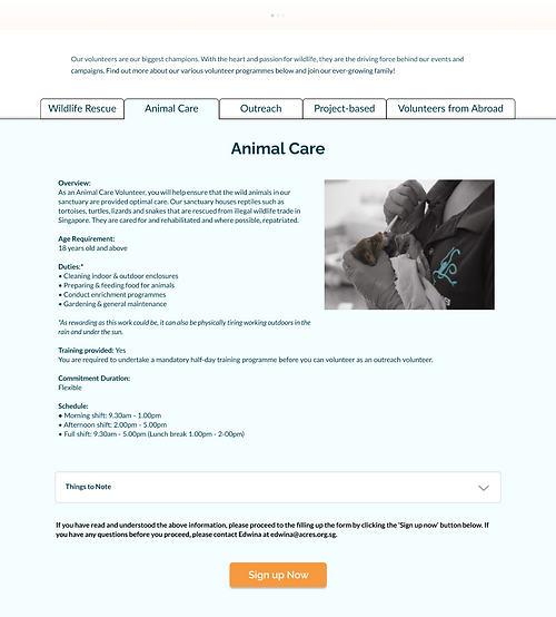
Information on all volunteer opportunities is presented within the main volunteer page
-
Each volunteer opportunity is contained in its individual tab, users can move across tabs to find out and select suitable role
-
This flow is more efficient as users now take a minimum of 4 steps to reach the submit application stage
08/
Sketches
We conducted design studio via Zoom to brainstorm ideas for the layout of the identified screens, namely Home Page, About Us Page, Donate Page and Volunteer Page. Below are some of the early and final sketches.


09/
Visual Design
We created mood board to define, inspire, and direct the visual design.

We kept the same look and feel while introducing complementary colour to help to guide users to navigate the website even better. It adds a bit more hierarchy and visual rest.
We also introduce a few shades of orange as a secondary colour, to make the website look a bit warmer, more welcoming and approachable to the users.
The content images portray wildlife and nature to elevate the spirit of ACRES that cares for wildlife.
The overall look and feel is clean, professional and welcoming.
A style guide was also created to ensure consistency in design.
Colours


Typography
10/
Prototype
We translated our final sketches into digital wireframes. We created a grey scale mid-fidelity prototype for the first usability test.

Mid-fidelity Prototype
With the feedback received from the usability test, we iterated to produce a hi-fidelity prototype, complete with colours and imagery, as guided by the mood board.
Hi-fidelity Prototype

We conducted the second usability test using the first hi-fidelity prototype.
11/
Test
We tested the functionality of our prototypes by conducting 2 rounds of usability test. Using the below methodology, we garnered users' feedback that helped us further improve our design.
Goal
To validate if users know how to use the website as it is intended
Logistics
Moderated, remote testing
Participants
5 per test round, age 21-51 years old
Metrics
Complete each task with no errors
Scenario
You have just been introduced to ACRES by your friend and you are interested to find out more.
Tasks
Find out more about the organisation
1
Usability Test 1
Mid-fidelity prototype
2
Make a one-time donation using credit card
3
Sign up as a volunteer
Usability Test 2
Hi-fidelity prototype
All participants completed the given tasks with no errors. At the end of each usability test, we asked the participants to complete a System Usability Scale (SUS) survey. The results from the surveys showed an increase in the SUS score, indicating the iterations have improved the usability of the website.
SUS Score
Usability Test 1
87
Grade A
(Excellent)
SUS Score
Usability Test 2
90.5
Grade A
(Excellent)
12/
Final Prototype


13/
Summary
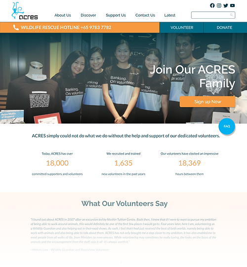
Guided by the 3 key focus areas, our redesign solutions aim to make information clear, concise and easily accessible to users, thus enabling them to make contributions efficiently with fewer steps. Our solution also took steps to bolster credibility so users can contribute to their desired causes with confidence.
Below is a summary of how our design solve the problems.

Clear & concise information
-
We organised information into tabs. By doing so, users can see the different volunteer options and programmes in one straight glance
-
We used accordion menu to hid some secondary content. By doing so, it makes the content-rich web page appear less daunting

Build credibility
-
We presented statistical information in bite-size format and showcase them in a visually prominent manner

Efficient & smooth process
-
We placed key action buttons at the top of the screen to ensure ease of access and to shorten the steps needed to accomplish those tasks
14/
Next Steps
-
Conduct content audit to update/ edit/remove content on the rest of the web pages
-
Engage other UX professionals to conduct heuristic analysis
-
Develop a mobile responsive website
-
Conduct more user interviews, expand interviewee profiles to include educators and wildlife lovers
15/
Retrospective
This team project was a good learning experience because we get to learn from each other, in particularly during the design studio session where we exchange ideas and improve on the design collectively.
The key learning from this project is team management and the role of timeboxing. Timeboxing is key to managing brainstorming/discussion sessions, especially for a project with short timeline. In order for the project to push forward, it is imperative to keep to the fixed time period.
Overall, it was a rewarding 2 week. It was an opportunity to put our UX knowledge into practice and to gain new knowledge at the same time.
Special thanks to project team members:
Khoo Yuin Yi, Project Manager & UX Designer
Brendan Chow, UX Designer
Calista Chen, UX Designer
Miranda Gomasjaya, UX Designer
Credits:
Banner Image of Squirrel - Photo by Caleb Martin on Unsplash
Persona (Purposeful Pete) - Photo by Good Faces on Unsplash
Persona (Cautious Caleb) - Photo by Bibek Thakuri on Unsplash